Wednesday, March 31, 2010
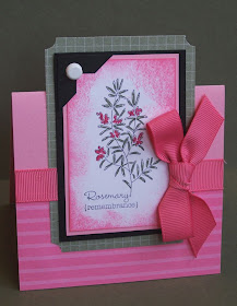
A flower for Boho Blossoms
Here's my card for today's sketch on Splitcoast Stampers.
I colored the image (Flower for All Seasons) with markers and I added flowers punched out with Boho Blossoms punch (with a brad center). For backgrounds I used my crimper and stamped with Sprinkles. I rounded a lot of corners and added some piercing.
The card looks really bright and cheerful in real life.
Colors: Old Olive, Summer Sun, Ruby Red, Chocolate Chip, White
Tuesday, March 30, 2010
Beautiful butterfly sketch
This is my interpretation of Mary Jo's lovely sketch found on her blog. When I saw the little squares I knew I wanted to use patterned paper. I also wanted to use a butterfly and keep it simple.
I used the colors from Splitcoast color challenge today - Basic Gray, Bermuda Bay and So Saffron. The patterned paper is Thoroughly Modern.
All supplies from Stampin' Up! I used the beautiful wings embosslit to make the butterfly. The sentiment is from Short & Sweet. The only embellishments are the brads and I used the scallop trim punch and word window punch.
Thanks for looking today. Have a great day!
Saturday, March 20, 2010
Herbal Tent Topper
Here are the cards I made for my grab bag swap. I received images from Herbal Expressions and all these great embellishments and patterned paper.
I decided to make a tent topper card - my first time. It's really easy to do. The card dimensions are 8 x 4.25, so when it's folded over plus the image part that extends up it's regular card size.
Apricot Appeal is one of the hardest colors for me, but I really like how this turned out paired with barely banana and dark green. The image is colored with marker and sponged. Isn't the clip so cute!
I made 2 pink and 2 yellow ones. The pink one has different embellishments. I put a larger size brad on a photo corner.
I even decorated the inside!
Hope you enjoy these. Try a tent topper! Very fun and easy!
Thursday, March 18, 2010
Another medallion technique
Here's yet another technique that works really well with the Medallion stamp. I really love this stamp and am having a lot of fun with it. I find that it works best when you use a brayer to ink it up, so it inks up more evenly.
To do this technique I used Versamark to emboss the medallion in white on glossy paper. Then I used some reinkers, rubbing alchohol and paper towel to dab the color on. The ink resists the embossed areas and disappears when you heat with the heat tool.
I used texturz embossing with the Big Shot to do the Certainly Celery background.
I used the horizontal slot punch to put the ribbon through and tied a little bow to put overtop.
I love how the Medallion pairs with sentiments and Short & Sweet is one of my favorites to use with it!
The card was made for Pals Paper Arts challenge #34 - sketch.
I used the colors from Curtain Call #21 - certainly celery, always artichoke, barely banana, white (and I added brown as a neutral).
Tuesday, March 16, 2010
White embossed medallion
Here's another technique using embossing and the medallion. It was for the Clean & Simple challenge to use green and brown.
The layout is from Clean & Simple stamping. Fall-To-Layout #82
I stamped the medallion with versamark and embossed with white embossing powder. I used the same pattern paper as yesterday's medallion sample.
To finish it off I used the scallop trim punch, striped ribbon, a button and linen thread.
Thanks for looking. I hope you enjoyed my medallion fun. I'm sure I'll have more yet to come!
Monday, March 15, 2010
Medallion fun!
I found someone who tried the emerging color technique with designer paper. I knew the medallion would be a perfect stamp to try that technique with.
I used a piece of Cottage Wall designer series paper. With versamark and clear embossing powder I heat embossed the image. Then I used my brayer to ink over the paper. The ink doesn't stick to the embossing, but covers the rest of the paper. The clear embossing shows off the paper underneath. Cool, huh?! These colors really pop too!
I used my new butterfly embosslit from Stampin' Up! - beautiful wings, on cottage wall designer series paper.
The sentiment from Whimsical Words (sale-a-bration set) was punched out with scallop oval, then layered on large oval. I also used the scallop trim border punch, 2 brads and Rich Razzleberry ribbon. Here's a close up...
I really love my medallion stamp. Tomorrow I'll show you a different embossing technique with the medallion.
Thursday, March 11, 2010
Top Note meets embossing folder
I found this lovely card by Cindy that I loved and wanted to copy.
I changed the colors, embellishments, the sentiment and I added designer paper, a flower and an embossed flower.
The background is an embossing folder from Stampin' Up! that I finally got. I love it!
Here's a close up of the details...
Stamp sets: Three Little Words, Vintage Vogue
Embellishments: embossing folder, Top Note die, Thoroughly Modern designer series paper, brads, kraft & white tafetta ribbon
2 for 1 fall-to-layout
I love getting layouts from Clean & Simple Stamping These cards are for Fall-To-Layout FTL81...
This first card uses a great color combination - pinks with black! I finally got the Beautiful Wings embosslit. Some of them are pretty tiny! I didn't realize there were 5 butterflies on there! Super value. I'll be having lots of fun with these guys! I thought they were the perfect accent to this clean & simple card. The sentiment on here is from Three Little Words.
For my second card I used a smaller circle punch and I showcased my new Short & Sweet set! Such a great set. I've been wanting it for so long and am sooooo glad I finally got it. I think I'll use it a lot! There's a double row of piercing on the bottom as my only "embellishment" for this clean & simple card.
I don't often make truly clean and simple cards, but these definitely are! My style isn't really over-embellished/tons of layers either. It's somewhere in the middle. That's the great thing about crafts and styles, everyone has their own tastes. I love lots of the different styles out there, but I seem to always end up making sort of the same in-the-middle type.
Thanks for stopping by today! Have a great day!
Monday, March 8, 2010
Combined textures
I got some time to combine a few challenges today.
CAS57 - Layer 2 shapes on a clean & simple card
DCBD167 - sketch challenge
CD58 - Colors - Certainly Celery, Tempting Turquoise, Regal Rose
I used Finial Press embossing which is really gorgeous in real life! I stamped the flower and leaves and border with "Sprinkles" stamp set.
Here's the close up!
Stampin' Up! stamp sets: Three Little Words, Sprinkles
Big Shot products: Finial press embossing folder, cherry blossom embosslit, little leaves
Embellishments: Jumbo Eyelet, Clear Rhinestone, Border Trim punch, stampin dimensionals
Colors: Tempting Turquoise, Certainly Celery, Regal Rose, White
Sunday, March 7, 2010
First Medallion
Friday, March 5, 2010
Love you deer
Here's a card I made for my Dear Husband last night. I used last week's sketch. I thought these two sets I got for Sale-A-Bration would be very cute together! This is my new Thoroughly Modern paper! I kept it monochromatic with Kraft and Soft Suede.
I popped up the word panel and the deer with Stampin' Dimensionals. I also pierced a bit in the corners. I used thread as my embellishment because it is more masculine than most other embellishments and it matches!!
I stuck this card in with my husband's lunch so he will have a nice happy surprise today.
Thursday, March 4, 2010
Swingin' Spring
Here's a Swing/Flip-Flop card I made for a card kit swap I'm in. I got the image (Serene Spring - retired Stampin' Up! set), the embellishments and the Kraft patterned paper as part of the card kit. This is the card I came up with to share with my group.
I watercolored the image only with colors from the cardstock. I pierced around it. I did a bit of distressing on the card base (frame part).
On the inside I used my Birds N Blooms die cut and my Big Shot and the Cherry Blossom embosslit.
The colors here are Soft Suede, Not Quite Navy and White and a bit of Kraft patterned paper.
Thanks for looking! Have a great day.