I haven't been creating a lot of new stuff lately but I wanted to post today and say thanks to all my followers and those who comment. I love learning and sharing my favorite past-time with other people who enjoy it.
Since I haven't made anything new I'll share a few of my past favorites...
Friday, December 31, 2010
Thursday, December 23, 2010
Cherry Cobbler POP
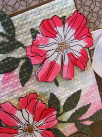
This card started with a sketch from Splitcoast and colors from two color challenges that I acidentally mixed up. The colors I used are Cherry Cobbler, Soft Suede, Always Artichoke, Very Vanilla. The designer series paper is Elegant Soiree, I just love this stuff!
I used watercolor paper, stamped the flower and blended with green, then I added the red. Then I stamped the flowers again on watercolor with StazOn black and colored with cherry cobbler and cut out and popped up over the original panel (Today's Ways to Use challenge at Splitcoast was to POP it up. The other thing I did to the panel was to glue the die cut leaves on and run it through the Big Shot with embossing folder to texture it all. (This was not my original idea, I saw it on a couple different cards recently).
I added a tiny strip of vanilla with the ribbon punch and a very vanilla ribbon. I REALLY LOVE how this turned out!
By the way, the flowers are from Fifth Ave Floral stamp set from Stampin' Up!
Monday, December 20, 2010
Textured and stitched
Here's a card I made for a few challenges.
The colors are from a previous color challenge - CC301 - gray, marina mist (blue), and concord crush (dark purple). I love how these colors look together!
To add some texture I used basic gray textured cardstock! The white piece was stamped with blue and purple for the sentiment, then I textured it with an embossing folder in my Big Shot. I added some ribbon and a scallop trim edge to match. The technique lover's challenge today was to do stitching (or faux stitching!) Very easy to do. Just pierce holes and connect the dots with a pen.
The layout is from my favorite layout site - Clean & Simple Stamping. Fall-to-layout #121
I layered pieces from 2 different circle punches as well as the boho blossoms punch with a rhinestone in the center.
Thursday, December 16, 2010
Fun pink challenges
Today I had lots of fun scrapbooking together with my mom, daughter, sister and nephew! This is one of the cards I came up with. It is for 3 challenges...
Diva Coffee Break Designs - sketch challenge
I found this sketch to look very hard, but this is exactly why I like doing challenges! I learn a lot!
The second challenge was to add lace with Pals Paper Arts. (ok, I messed up and this isn't a clean and simple design.) Anyways, it was a challenge to add lace, but I really like how it ended up! I added the scallop trim border to help with the lacy look!
The third challenge is Stampin Royalty - BLING! I knew from the beginning of making this card where I would add the bling - to the hearts and the sentiment and it turned out just right and added the perfect touch!
I got to showcase some patterned paper and also use a bit of texture on the circles behind the hearts.
Sunday, December 12, 2010
2 challenge ORNAMENT
This card was for Curtain Call's color challenge - old olive, certainly celery, white, chocolate chip, real red.
The layout is from Clean & Simple Stamping.
The ornament was stamped first with white, then with the stamp a ma jig I stamped slightly off with green. The brown panel is crimped and there is a bit of patterned paper.
Friday, December 10, 2010
star with stripes pattern
This card pattern was inspired by this wonderful card.
I used a corner rounder on some squares. Two star die cuts, a jumbo eyelet, and a crimper! The sentiment is from Hodgepodge Happiness.
I think this card is really cute and works well as a male card.
Thursday, December 9, 2010
Wheat Silhouette
Wednesday, December 8, 2010
Sahara Sand WOW
This card was inspired by Petal Pusher aka Mary Fish's beautiful card here. What a simple and stunning layout!
I chose to use these colors - Sahara Sand (a color that I find hard to use), Black and Very Vanilla. This color combination is just awesome!
The background is embossed with my Big Shot. The sentiment is from Occasional Quotes (hostess set)
Wednesday, December 1, 2010
Silver swirled Dasher
Silver and Dasher - what could be better...
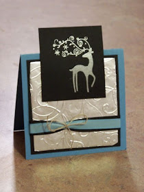
This is the tent topper card I designed for our Stamp Group this month.
The Dasher image is stamped on black and heat embossed with silver. The silver on the card base is actually TIN FOIL! that I ran through the Big Shot.
I double layered a black and blue ribbon (to match the black and Marina Mist paper of course!) and tied it in the middle with a linen thread bow!
HAPPY DECEMBER!
Sunday, November 28, 2010
Vintage Beautiful
I don't know if vintage is really my favorite style, but I sure love the VINTAGE VOGUE stamp set and the lacy ribbon!
This card was inspired by Featured Stamper Krischir's card here
What I really LOVE about this card is the awesome color combination - Cherry Cobbler, Soft Suede (Elegant Soiree DSP), White and Crumb Cake. You can't really go wrong with that!
This card was inspired by Featured Stamper Krischir's card here
What I really LOVE about this card is the awesome color combination - Cherry Cobbler, Soft Suede (Elegant Soiree DSP), White and Crumb Cake. You can't really go wrong with that!
Saturday, November 27, 2010
Pink Razzleberry Espresso
What a great color combination from Diva Coffee Break Designs.
The colors don't really turn out that well in these pictures, but I really like this combo!
What you probably can't see very well from these pictures is that I stamped the flowers from Punch Potpourri in early espresso just along the one edge. I stamped one set of flowers in purple and punched them out with the coordinating Boho Blossoms punch.
I embossed the vanilla background and added one pink butterfly embosslit.
I've seen this type of layout on two different cards I've seen recently and that's where I got my inspiration from.
Thursday, November 25, 2010
Punch Potpourri x2
These two cards I made today using the hostess set "punch potpourri"
This card is for the Technique Lovers Challenge this week on Splitcoast.
It also uses the sketch from Just Add Ink.
This card is also for the Technique Lovers Challenge on Splitcoast.
The layout is from Stampin' Royalty.
The color combination is from Splitcoast - Cherry Cobbler, Chocolate Chip, Crumb Cake.
Saturday, November 20, 2010
Short & Sweet stars
Sunday, November 14, 2010
Falling Autumn leaves
What great colors together! Peach Parfait, Early Espresso, Cherry Cobbler and white.
This card was made for another VSN challenge on Splitcoast Stampers. To make a card using the same image stamped 3 times as a focal point.
I have two ribbons stacked on top of each other. The background is embossed and I ripped the cherry cobbler.
Here's a close up of the popped up leaf...
Saturday, November 13, 2010
So Rich!
Here's the card I created for the VSN weekend at Splitcoast. "Dressed to the Nines!" This card reminds me of a tuxedo.
I stamped the flower on red and green, then cut the pieces out.
I used 2 different embossing folders, the top note die, black satin ribbon and some rhinestones!
Stampin' Up! stamp set: Because I Care (hostess set)
Colors: White, Black, Riding Hood Red, Cherry Cobbler
Friday, November 12, 2010
Christmas gift tags
I've been making Christmas tags to sell at the craft show tomorrow.
For this set I used Color Dare colors. They sounded like a really fun combination - soft suede, night of navy, pear pizzazz.
This is how I packaged them.
If you're interested in ordering Christmas tags, Christmas cards or even cards for a YEAR, let me know! I'd be happy to make them for you. I can also make calendars! I make one every year for my family.
Sunday, November 7, 2010
Very Merry SNOW
Friday, November 5, 2010
Pieced Tulips
This card was made for Diva Coffee Break Design's card sketch this week and colors from last week - Baja Breeze, Poppy Parade, So Saffron.
I paper pieced the tulips and bird to make the colors really pop. I used oval, modern label and word window punches. Also my new embossing folder and the beautiful elegant soiree patterned paper.
Thursday, November 4, 2010
Attempt at embedded embossing
I have to say I REALLY LOVE this card! I'm glad I completed my attempt because it was a bit discouraging to see the results of this technique at first.
This card is a combination of challenges. There are so many great challenges out there and I hate to miss them - so when I can I combine a few (then I don't have to think so hard about what/how to create!)
Challenge #1 - Technique Lover's Challenge at Splitcoast - A brand new technique called embedded image! I chose a flower image and stamped multiple times with daffodil delight on a white paper. I versamarked the whole piece of paper and embossed with clear 3 times (my clear embossing powder has flecks of other colors in it, but I really liked the effect for this challenge). Then I tried stamping in versamark and red and clear embossing the butterfly overtop the background, but it only showed a faint red smudge. Then I tried stamping the butterfly again with versamark and embossing with silver! It also turned out to be a blob - this time a silver blob! I realized that for this technique you need to use a silhouette image. For one last attempt I used black Staz On to stamp over top. I am happy with the end result (even if I cheated a tiny bit). I think the blurry red and silver behind the butterfly look kind of cool and add to the effect.
Challenge #2 - Color challenge from Pals Paper Arts - Daffodil Delight, Basic Gray and Poppy Parade. I admit I was very skeptic about this color choice at first but I saw some great samples that inspired me. I decided to really use the gray and white and just use a tiny bit of the other colors.
Challenge #3 - Sketch challenge from Just Add Ink. I decided to use my ribbon punch to add a bit of frill under the ribbon. I have admired the many beautiful bows out there. I tried to create a double bow. I ended up just piecing a bunch of ribbon strips together.
Here are some close ups...
My photos DO NOT do this card justice!
Stamp sets used: Stampin' Up! Of the Earth, God's Beauty
Saturday, October 30, 2010
Happy Birthday TWO you!
I had a chance to make some cards this morning and I missed a bunch of wonderful challenges this week. I maximized my card making efforts by combining some of the challenges...
Just Add Ink - JAI41 - Just add BIRTHDAY!
Clean & Simple Stamping - FTL114 - sketch
I also wanted to challenge myself to make some MALE cards because I seem to have a lack of those and I find them the hardest to make!
Here's what I came up with...
For this gray card I gained inspiration from the Inspiration Challenge at Splitcoast Stampers. I chose this bracelet to inspire me.
I used textured paper and also textured the stars. I added a scored line and some brads. Here's a close up...
For the black card I wanted to play along with the one layer challenge - OLW26 - to use black, red and white on a one layer card. I hope punches don't disqualify this from being one layer. I wasn't sure.
I changed the scored lines for this one and also added one more brad.
So what did my husband think?.... are they good male cards?....
He said they're ok. He likes the black one better.
AGH - he's so hard to make cards for!
Just Add Ink - JAI41 - Just add BIRTHDAY!
Clean & Simple Stamping - FTL114 - sketch
I also wanted to challenge myself to make some MALE cards because I seem to have a lack of those and I find them the hardest to make!
Here's what I came up with...
For this gray card I gained inspiration from the Inspiration Challenge at Splitcoast Stampers. I chose this bracelet to inspire me.
I used textured paper and also textured the stars. I added a scored line and some brads. Here's a close up...
For the black card I wanted to play along with the one layer challenge - OLW26 - to use black, red and white on a one layer card. I hope punches don't disqualify this from being one layer. I wasn't sure.
I changed the scored lines for this one and also added one more brad.
So what did my husband think?.... are they good male cards?....
He said they're ok. He likes the black one better.
AGH - he's so hard to make cards for!